Shopify
Recommended Shopify Image Sizes (2025)
ResizeHere’s a breakdown of optimal dimensions for various image types in your Primarystore:
| Image Type | Recommended Size | Aspect Ratio | Notes |
| Product Images | 2048 x 2048 px | 1:1 | Best for zoom and clarity |
| Collection Images | 1024 x 1024 px | 1:1 | Used in collection grids |
| Collection Banners | 2800 x 1000 px | 2.8:1 | Full-width headers |
| Homepage Banners (Desktop) | 1200 x 400 px | 3:1 | Horizontal layout |
| Homepage Banners (Mobile) | 800 x 600 px | 4:3 | Optimized for mobile |
| Blog Featured Images | 1920 x 1080 px | 16:9 | For blog headers |
| Blog Thumbnails | 1200 x 800 px | 3:2 | For previews and listings |
| Logo | Up to 450 x 250 px | Varies | Keep file size small for fast loading |
Tips for Uploading to Your Main System
- Use JPG or WebP formats for best balance of quality and load speed.
- Compress images before uploading to avoid slowing down your site.
- Maintain consistent aspect ratios to avoid cropping or distortion.
- Avoid overly large files Shopify limits image
in Huge ERPuploads to72020xMB.
This will have the image appear a normal
Selecting Your Theme
FirstA youShopify needonline store theme is a customizable template that controls the look, layout, and functionality of your storefront. It defines how your products, pages, and navigation appear to choosecustomers theacross themedesktop forand your page. mobile.
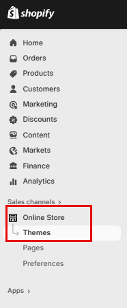
Click on "“Online StoreStore”" andin the left-hand menu, then "select Themes“Themes.”"
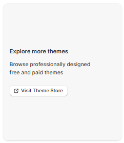
The Dawn Themetheme will automatically beis installed by default,default howeverfor ifnew youstores.
If wantyou'd like to changeexplore theother Theme,themes, scroll down and click on "“Visit Theme StoreStore”" to browse free and paid options.
Customize your Store
To customize your store, click on "Customize" this will take you into the store editor.

Announcement Bar
The Announcement Bar in Shopify is a customizable banner that appears at the top of your online store, used to highlight important messages like promotions, shipping updates, or store news. It’s a simple but powerful tool to grab attention and guide customer behavior.

Commonly Used for:
- “Free shipping on orders over $50”
- “Holiday sale ends Sunday!”
- “We’re currently experiencing shipping delays”
- “New gift cards now available”
How to Add or Edit It
- Go to Online Store > Themes > Customize
- Select the Header or Announcement Bar section
- Enter your message, choose colors, and set visibility from the
Announcement Bar Settings
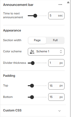
Time to Next Announcement
- Slider (e.g., 5 sec): Controls how long each announcement stays visible before switching to the next one (if you have multiple messages rotating).
Appearance
- Section Width:
- Page: Keeps the bar aligned with your page content width.
- Full (selected): Stretches the bar across the entire screen width for maximum visibility.
- Color Scheme: Choose a predefined color palette (e.g., Scheme 1) that matches your store’s branding.
- Divider Thickness: Adds a horizontal line below the bar. The slider (e.g., 1 px) controls how thick that line is.
Padding
- Top & Bottom (e.g., 15 px): Adds space above and below the announcement bar to control its vertical spacing. Useful for visual balance and readability.
Custom CSS
- Expandable section where you can add custom styling rules (CSS) to fine tune the look, like font tweaks, animations, or responsive behavior.
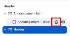
You can delete this bar as well by hovering over "Announcement" and clicking on the Bin icon
Header Bar
YouThe can change thisheader bar is the top section of your store that displays your logo, navigation menu, search, and cart icons. It helps customers find key pages like Shop or Contact, return to lookthe howeverhomepage, youand want.access their cart.

Header Menu Settings
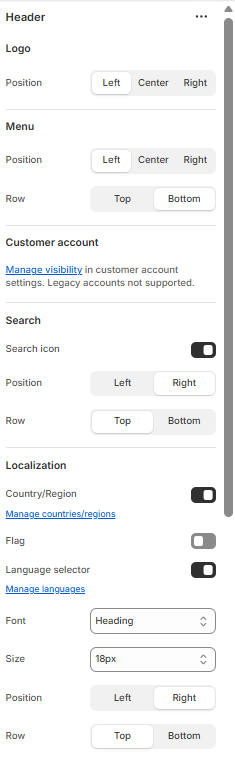
Logo
ClickPosition: Choose where your logo appears—Left, Center, or Right.
- Position: Set the horizontal alignment of your navigation menu.
- Row: Choose whether the menu appears on the Top or Bottom row of the header.
Customer Account
- Visibility: Manage whether the customer account icon is shown. Note: legacy accounts are not supported.
Search
- Search Icon: Toggle visibility of the search icon.
- Position: Align the icon to the Left or Right.
- Row: Choose Top or Bottom placement within the header.
Localization
- Country/Region: Toggle to show or hide country/region selector.
- Flag: Toggle to display country flags.
- Language Selector: Toggle to enable language switching.
- Manage Countries/Languages: Access settings to configure available regions and languages.
Font Settings
- Font: Select the font style used in the header.
- Size: Choose the font size (e.g., 18px).
- Position & Row: Control where the text appears—Left or Right, Top or Bottom.
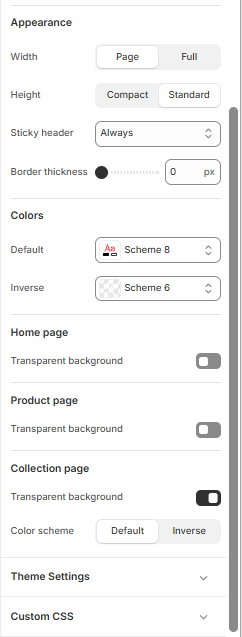
Appearance
- Width: Choose between “Page” (aligned with page content) or “Full” (spans entire screen).
- Height: Select “Compact” for a slim header or “Standard” for a taller layout.
Color and Transparency Settings
These settings control the visual styling of your header and page backgrounds:
- Color Scheme: Choose from predefined schemes (e.g., Scheme 1, Scheme 8, Inverse) to match your brand.
- Bottom Row Scheme: Apply a separate color scheme to the lower portion of the header if supported.
- Transparent Backgrounds:
- Home Page: Toggle transparency for a clean, overlay-style header.
- Product Page: Enable transparency to let product imagery shine through.
- Collection Page: Combine transparency with color schemes for visual consistency.
Theme Settings
- Custom CSS: Expand this section to apply advanced styling rules for full control over header appearance.
Menu tab- Main
When you click on theMenu left>
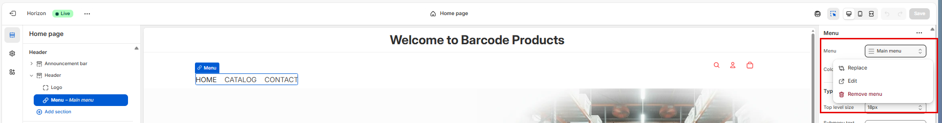
Here's a breakdown of what each section in your screenshot controls:
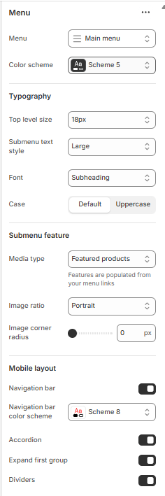
Typography
- Top level size: Controls the font size of your main menu items (e.g., Home, Shop, Contact).
- Submenu text style: Sets the size or emphasis of dropdown items (e.g., bold, large).
- Font: Chooses the font style for menu text (e.g., Subheading, Body).
- Case: Toggles between default casing and uppercase for menu labels.
This section enhances dropdown menus with visual content:
- Media type: Lets you display images or featured products within dropdowns.
- “Featured products” pulls product images from linked collections.
- Image ratio: Defines the shape of images (e.g., Portrait, Square).
- Image corner radius: Adjusts how rounded the image corners are (0 px = sharp corners).
Mobile Layout
Controls how the menu behaves on mobile devices:
Announcement Bar
Here you can add a welcome message to your Shopify store page
Click on "Announcement" and on the right you add the text.
Here you can add, discount codes or let your customers know at what amount they qualify for free shipping and so forth.
You can delete this bar as well by hovering over "Announcement" and clicking on the Bin icon
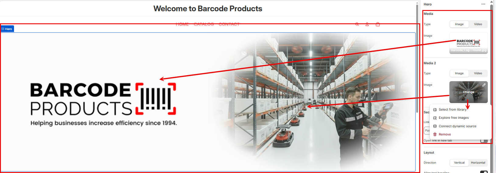
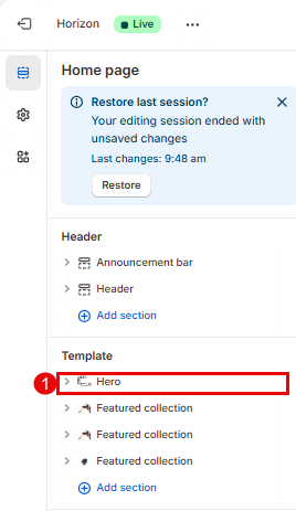
Hero Image
Add your Hero Image by clicking on "Hero" on the left side on the screen.
Click on the image icon on the right of the screen for "Media" and "Media 2", Here you can also add a will see it have teh word "Change" in the middle which will give you the option to add an image from Library or you can search for a free image.