Shopify Guide - Building Your Shopify Store
Recommended Shopify Image Sizes (2025)
Here’s a breakdown of optimal dimensions for various image types in your store:
| Image Type | Recommended Size | Aspect Ratio | Notes |
| Product Images | 2048 x 2048 px | 1:1 | Best for zoom and clarity |
| Collection Images | 1024 x 1024 px | 1:1 | Used in collection grids |
| Collection Banners | 2800 x 1000 px | 2.8:1 | Full-width headers |
| Homepage Banners (Desktop) | 1200 x 400 px | 3:1 | Horizontal layout |
| Homepage Banners (Mobile) | 800 x 600 px | 4:3 | Optimized for mobile |
| Blog Featured Images | 1920 x 1080 px | 16:9 | For blog headers |
| Blog Thumbnails | 1200 x 800 px | 3:2 | For previews and listings |
| Logo | Up to 450 x 250 px | Varies | Keep file size small for fast loading |
Tips for Uploading to Your Main System
- Use JPG or WebP formats for best balance of quality and load speed.
- Compress images before uploading to avoid slowing down your site.
- Maintain consistent aspect ratios to avoid cropping or distortion.
- Avoid overly large files Shopify limits image uploads to 20 MB.
Selecting Your Theme
A Shopify online store theme is a customizable template that controls the look, layout, and functionality of your storefront. It defines how your products, pages, and navigation appear to customers across desktop and mobile.
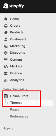
Click on “Online Store” in the left-hand menu, then select “Themes.”
The Dawn theme is installed by default for new stores.
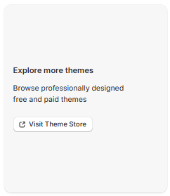
If you'd like to explore other themes, scroll down and click “Visit Theme Store” to browse free and paid options.
Customize your Store
To customize your store, click on "Customize" this will take you into the store editor.

Main Header (Home Page)
Announcement Bar
The Announcement Bar in Shopify is a customizable banner that appears at the top of your online store, used to highlight important messages like promotions, shipping updates, or store news. It’s a simple but powerful tool to grab attention and guide customer behavior.

Commonly Used for:
- “Free shipping on orders over $50”
- “Holiday sale ends Sunday!”
- “We’re currently experiencing shipping delays”
- “New gift cards now available”
How to Add or Edit It
- Go to Online Store > Themes > Customize
- Select the Header or Announcement Bar section
- Enter your message, choose colors, and set visibility from the
Announcement Bar Settings
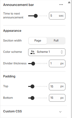
Time to Next Announcement
- Slider (e.g., 5 sec): Controls how long each announcement stays visible before switching to the next one (if you have multiple messages rotating).
Appearance
- Section Width:
- Page: Keeps the bar aligned with your page content width.
- Full (selected): Stretches the bar across the entire screen width for maximum visibility.
- Color Scheme: Choose a predefined color palette (e.g., Scheme 1) that matches your store’s branding.
- Divider Thickness: Adds a horizontal line below the bar. The slider (e.g., 1 px) controls how thick that line is.
Padding
- Top & Bottom (e.g., 15 px): Adds space above and below the announcement bar to control its vertical spacing. Useful for visual balance and readability.
Custom CSS
- Expandable section where you can add custom styling rules (CSS) to fine tune the look, like font tweaks, animations, or responsive behavior.
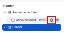
You can delete this bar as well by hovering over "Announcement" and clicking on the Bin icon
Header Bar
The header bar is the top section of your store that displays your logo, navigation menu, search, and cart icons. It helps customers find key pages like Shop or Contact, return to the homepage, and access their cart.

Header Menu Settings
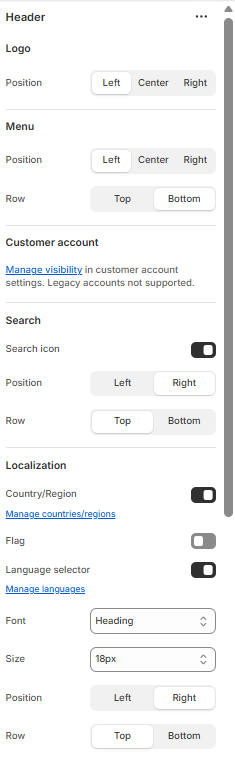
Logo
- Position: Choose where your logo appears—Left, Center, or Right.
- Position: Set the horizontal alignment of your navigation menu.
- Row: Choose whether the menu appears on the Top or Bottom row of the header.
Customer Account
- Visibility: Manage whether the customer account icon is shown. Note: legacy accounts are not supported.
Search
- Search Icon: Toggle visibility of the search icon.
- Position: Align the icon to the Left or Right.
- Row: Choose Top or Bottom placement within the header.
Localization
- Country/Region: Toggle to show or hide country/region selector.
- Flag: Toggle to display country flags.
- Language Selector: Toggle to enable language switching.
- Manage Countries/Languages: Access settings to configure available regions and languages.
Font Settings
- Font: Select the font style used in the header.
- Size: Choose the font size (e.g., 18px).
- Position & Row: Control where the text appears—Left or Right, Top or Bottom.
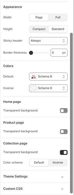
Appearance
- Width: Choose between “Page” (aligned with page content) or “Full” (spans entire screen).
- Height: Select “Compact” for a slim header or “Standard” for a taller layout.
Color and Transparency Settings
These settings control the visual styling of your header and page backgrounds:
- Color Scheme: Choose from predefined schemes (e.g., Scheme 1, Scheme 8, Inverse) to match your brand.
- Bottom Row Scheme: Apply a separate color scheme to the lower portion of the header if supported.
- Transparent Backgrounds:
- Home Page: Toggle transparency for a clean, overlay-style header.
- Product Page: Enable transparency to let product imagery shine through.
- Collection Page: Combine transparency with color schemes for visual consistency.
Theme Settings
- Custom CSS: Expand this section to apply advanced styling rules for full control over header appearance.
Logo
The Logo tab controls how your store’s logo appears in the header. This is a key branding element that helps customers recognize your business and navigate back to the homepage.
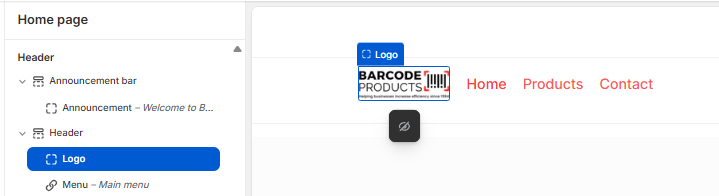
Logo Settings
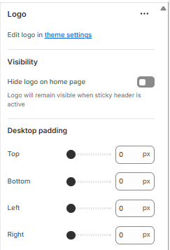
Edit Logo
- Edit logo in theme settings:
To change the logo image itself (upload, replace, or resize), go to your theme’s main settings panel.
Visibility
- Hide logo on home page (toggle):
If enabled, the logo will be hidden on the homepage but will still appear when the sticky header is active (e.g., during scrolling). Useful for minimalist designs or when the homepage already features a large logo elsewhere.
Desktop Padding
Controls the spacing around your logo on desktop devices:
- Top / Bottom / Left / Right (px):
Use sliders or input fields to fine-tune the logo’s placement. - Example: Increase top padding to lower the logo vertically
- Set left/right padding to center or offset the logo horizontally
Position:
Choose where the logo appears within the header:
- Left: Common for traditional layouts
- Center: Ideal for minimalist or symmetrical designs
- Right: Less common, but useful for specific branding styles
Best Practices
- Use a high-resolution logo with a transparent background (PNG format recommended).
- Keep the logo size proportionate to your header height for visual balance.
- Ensure it’s clickable, most themes link the logo to your homepage by default.
Menu - Main
When you click on Menu > Main menu in Shopify’s theme editor, you're customizing how your store’s primary navigation menu looks and behaves across desktop and mobile.

Main Menu Settings
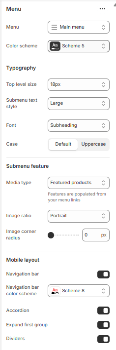
Typography
- Top level size: Controls the font size of your main menu items (e.g., Home, Shop, Contact).
- Submenu text style: Sets the size or emphasis of dropdown items (e.g., bold, large).
- Font: Chooses the font style for menu text (e.g., Subheading, Body).
- Case: Toggles between default casing and uppercase for menu labels.
This section enhances dropdown menus with visual content:
- Media type: Lets you display images or featured products within dropdowns.
- “Featured products” pulls product images from linked collections.
- Image ratio: Defines the shape of images (e.g., Portrait, Square).
- Image corner radius: Adjusts how rounded the image corners are (0 px = sharp corners).
Mobile Layout
Controls how the menu behaves on mobile devices:
Divider
In Shopify theme settings, the divider refers to a thin horizontal line used to visually separate sections, often between the header and the rest of the page or within the announcement bar.
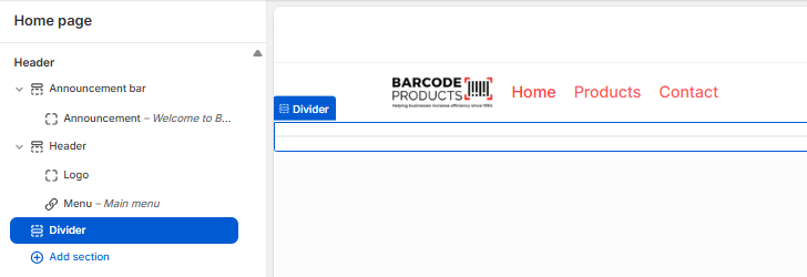
Divider Settings
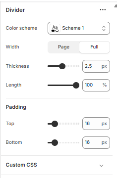
Divider
- Color Scheme:
Select a predefined color palette (e.g., Scheme 1) that matches your store’s branding. This affects the divider’s color. - Width:
- Page: Aligns the divider with your page content width.
- Full: Stretches the divider across the entire screen for a bold, clean break.
- Thickness:
Adjusts how thick the line appears. For example, 2.5 px creates a medium weight divider, visible but not overpowering. - Length:
Controls how much horizontal space the divider spans (e.g., 100% = full width). You can reduce this for a centered or stylized look.
Padding
- Top & Bottom Padding:
Adds vertical spacing above and below the divider (e.g., 16 px). This helps balance layout and prevent crowding.
Custom CSS
- Expand this section to apply advanced styling rules—such as dashed lines, animations, or responsive behavior.
Add Section
The Add Section tool lets you insert new content blocks into your store’s pages, like your homepage, product pages, or custom templates. It’s a flexible way to build and organize your layout without editing code.
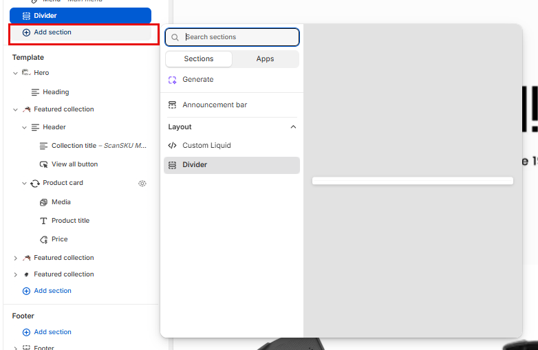
What You Can Add
- Visual elements: Hero banners, slideshows, images, videos
- Product displays: Featured collections, product grids, product cards
- Text blocks: Headings, testimonials, rich text, FAQs
- Functional tools: Announcement bars, dividers, custom Liquid, contact forms
- Apps: If installed, app-based sections may appear here too
How to Use It
- In the theme editor, click “Add Section”
- Use the search bar or browse tabs like Sections and Apps
- Select a section (e.g., Divider, Featured Collection)
- Customize its content, layout, and styling using the right-hand panel
- Drag to reorder or remove as needed
Layout Tip
Sections are modular, each one can be added, removed, or repositioned independently. This makes it easy to test layouts, highlight seasonal content, or tailor pages to your business needs.
Template
Hero Image
A hero image in Shopify is the large, eye-catching banner at the top of your homepage that creates your store’s first impression. It’s often the first thing visitors see and plays a key role in setting the tone, showcasing your brand, and guiding users toward action.
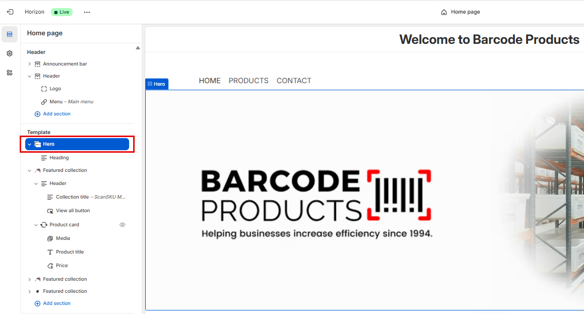
Hero Settings

Upload Media
-
- Media 1: Upload your “first” logo image.
- Media 2: Upload the "Second" logo image.
- Set both media types to Image.
Configure Layout
-
- Direction: Choose Vertical or Horizontal depending on how you want the images and text stacked.
- Alignment: Set to Left, Center, or Right.
- Position: Choose Bottom to anchor content lower in the section.
- Gap: Set to 24 px.
- Width: Select Full for edge-to-edge display.
- Height: Choose Medium for balanced vertical space.
Add Section Link
-
- Paste your desired URL (e.g., product page or collection).
- Toggle Open in new tab if needed.
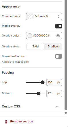
Set Appearance
-
- Color scheme: Use Scheme 6 (customizable in theme settings).
- Media overlay: Leave off unless you want a semi-transparent layer over images.
- Overlay color: Set to
#00000003for a subtle tint. - Overlay style: Choose Solid or Gradient.
- Blurred reflection: Leave off unless you want a mirrored effect below images.
Adjust Padding
-
- Top: Set to 100 px.
- Bottom: Set to 72 px.
Optional: Add Custom CSS
- Use this field to fine-tune styles (e.g., font size, button styling).
Heading
In Shopify’s Online Store > Theme > Customize view, the “Heading” under the Hero section in the Template refers to the main title text that appears inside your hero banner on the homepage.
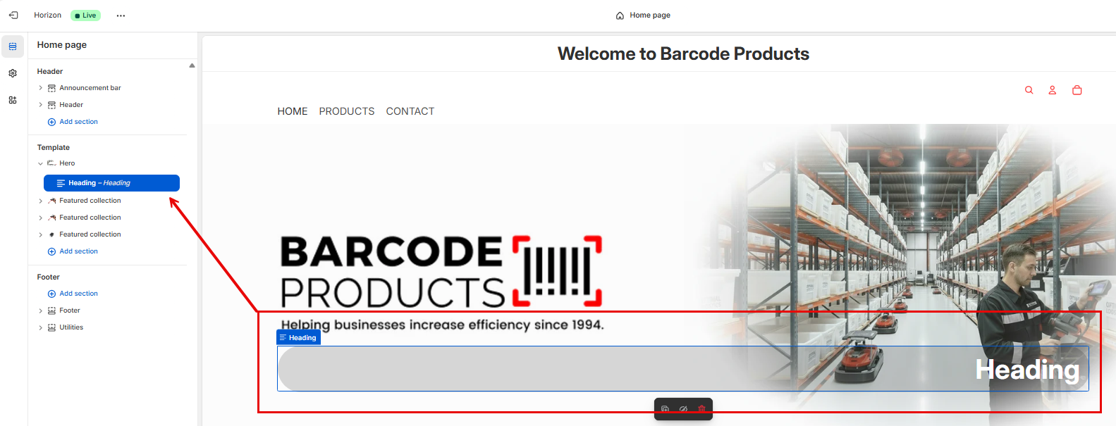
Heading Settings
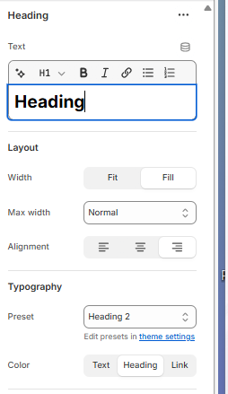
Text Field
- Heading: This is where you type the main title that appears in your Hero section.
Formatting Toolbar
- H1: Sets the heading level (H1 is the largest and most prominent).
- B: Bold
- I: Italic
- Link icon: Insert a hyperlink into the heading text
- Other icons may include underline, strikethrough, or list formatting depending on your theme
Layout Options
- Width:
- Fit: The heading only takes up as much space as the text needs
- Fill: The heading stretches to fill the available space
- Max Width: Controls how wide the heading can grow (e.g., “Normal” keeps it readable)
- Alignment: Aligns the heading text to the Left, Center, or Right
Typography
- Preset: Applies a predefined style (e.g., “Heading 2” uses a specific font, size, and weight)
- Edit presets in theme settings: Opens the theme’s typography settings where you can customize fonts, sizes, and styles globally
Color Settings
- Text: Color of any regular text
- Heading: Color of the heading itself
- Link: Color of any links added to the heading
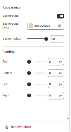
Background
- Toggle Background ON to enable color behind the block
- Background color: Set the colour of the background
- Corner radius: Use the slider to set the roundness of the corners
Padding
- Adjust padding sliders
These settings create a clean, edge-to-edge block with a soft background and rounded corners — ideal for overlaying text on images without clutter.
Save Your Changes
- Click Save in the top right to apply the block styling
Feature Collection
A featured collection is a curated group of products displayed prominently on your store, often on the homepage.
It’s used to showcase:
- Best sellers
- New arrivals
- Seasonal promotions
- Product categories
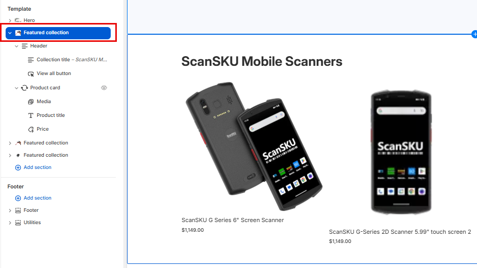
Feature Collection Setup
Step 1: Create a Collection
This interface lets you create a collection, which is a group of products organized around a theme (e.g., “Summer Picks,” “Under $100,” “Mobile Scanners”). Collections help customers browse and discover products more easily.
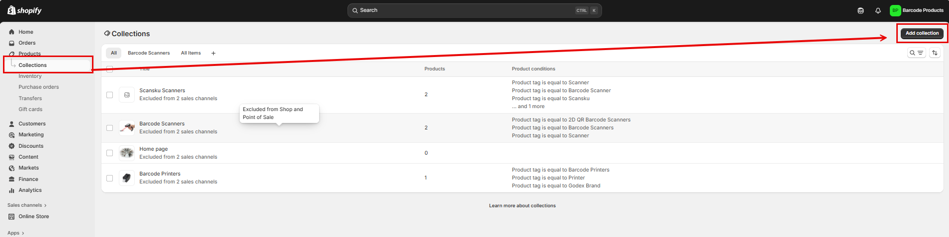
- Go to Shopify Admin > Products > Collections
- Click Add collection
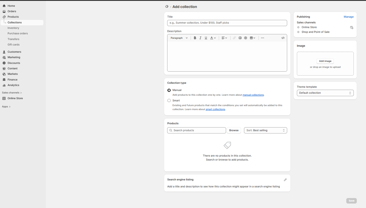
Title
- Purpose: Name your collection.
- Example: “ScanSKU Mobile Scanners” or “Barcode Essentials”
- This title appears on your storefront and in navigation menus.
Description
- Purpose: Add a short explanation or marketing message for the collection.
- Example: “Explore our top-rated mobile barcode scanners designed for warehouse and retail environments.”
- You can format text (bold, italic, links) using the toolbar.
Collection Type
Choose how products are added:
- Manual
- You hand-pick products for the collection.
- Best for curated selections or promotional groups.
- Smart (Automated)
- Products are added automatically based on rules (e.g., tag = “scanner” or price < $100).
- Great for dynamic collections that update as inventory changes.
Products
- Search or browse to add products (for manual collections).
- You’ll see a list of added products here.
- You can sort them (e.g., by best selling, price, alphabetical).
Search Engine Listing
- Purpose: Customize how this collection appears in Google or other search engines.
- Add a SEO title and meta description to improve visibility.
Publishing
- Choose where this collection is available:
- Online Store
- Shop and Point of Sale
- You can also schedule visibility or hide it temporarily.
Image
- Upload a cover image for the collection.
- Appears on collection pages and in featured sections.
Theme Template
- Choose which template layout to use for the collection page.
- Most stores use Default collection, but custom templates can be created.
- Click Save to create the collection and make it available for use in your store.
Add the Collection to Your Homepage
- Go to Online Store > Themes > Customize
- In the left sidebar, click Add section
- Scroll down to Collections
- Select what you would like to add
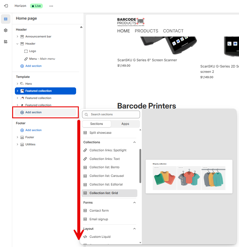
Personalize the view of your Template
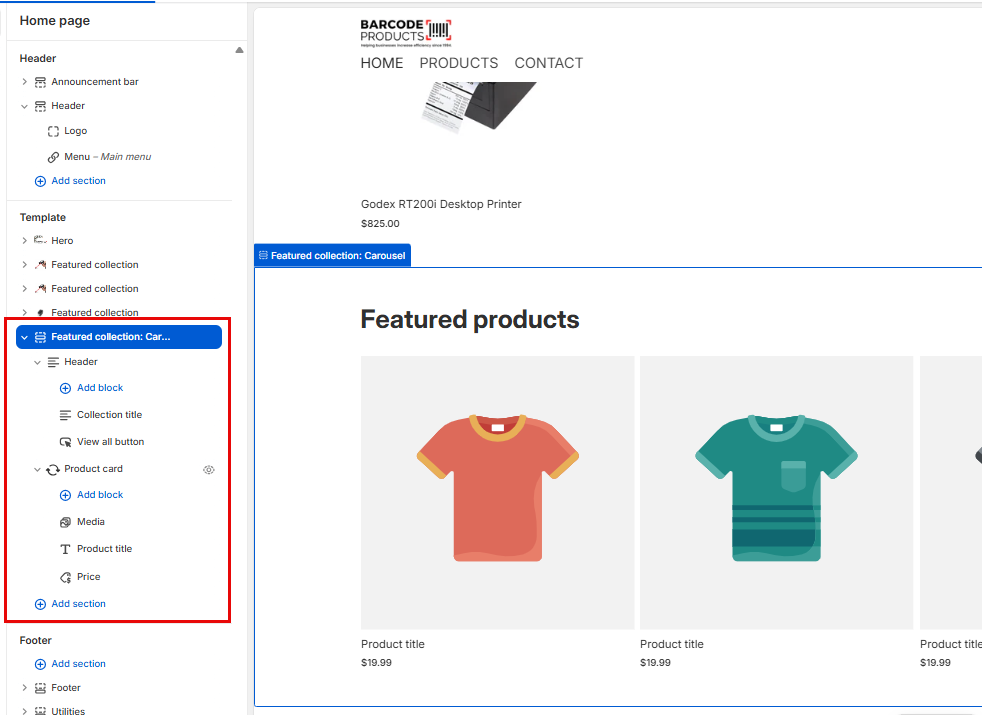
Each tab includes configurable settings located in the panel on the right-hand side of the screen when you click on it.
Featured Collection
This is the overall container for showcasing a group of products from a specific collection.
Carousel Settings
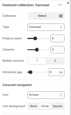
Collection
Select which product collection to display in the carousel (e.g., “Car Accessories”).
Type
Choose the layout style — in this case, “Carousel” means products scroll horizontally.
Product count
Sets how many products from the collection will be shown in the carousel.
Columns
Controls how many product cards are displayed side-by-side on desktop screens.
Mobile columns
Sets how many product cards appear per row on mobile devices (typically 1 or 2).
Horizontal gap
Adjusts the spacing (in pixels) between product cards in the carousel.
Icon
Selects the style of navigation arrows (e.g., arrows, chevrons) used to scroll through products.
Icon background
Defines the shape or style behind the navigation icons:
- None: Icons appear without a background.
- Circle: Icons are placed inside circular backgrounds.
- Square: Icons are placed inside square backgrounds.
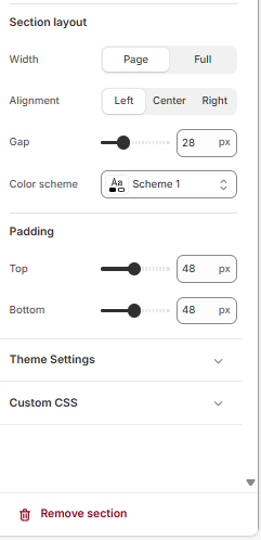
Section Layout Settings
Width
Determines how wide the section spans across the page:
-
- Page: Aligns with your site's standard content width.
- Full: Stretches the section edge-to-edge across the screen.
Alignment
Sets the horizontal positioning of content within the section:
-
-
- Left, Center, or Right.
-
Gap
Controls the spacing between elements inside the section (e.g., between product cards or blocks). Measured in pixels.
Color scheme
Applies a predefined theme color set (e.g., background, text, buttons) based on your store’s design system — “Scheme 1” is one of those presets.
Padding Settings
Top / Bottom
Adjusts the vertical spacing above and below the section. Useful for creating breathing room between sections.
Theme Settings
Custom CSS
Allows you to apply custom styling rules if you want advanced control beyond the built-in options (e.g., font tweaks, hover effects).
Remove Section
Deletes the entire section from your homepage layout.
Header
Controls the top part of the featured collection display.
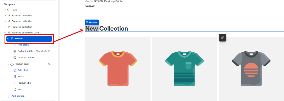
- Add block: Lets you insert additional header elements like text, images, or buttons.
- Collection title: Displays the name of the collection (e.g., “Car Accessories”).
- View all button: Adds a clickable button that links to the full collection page.
Header Settings

Layout Settings
Controls how header elements (like title, subtitle, buttons) are arranged:
-
- Vertical stacks them top-to-bottom.
- Horizontal places them side-by-side.
Vertical on mobile
Forces a vertical layout on smaller screens for better readability and spacing.
- Alignment: Space between
Defines how elements are spaced within the header. “Space between” pushes items to the edges with space in between. Other options may include “Start,” “Center,” or “End.” - Position: Top / Center / Bottom
Sets the vertical placement of the header content within the section. - Align text baseline
Ensures that text elements align along their baseline for a cleaner, more consistent look — especially useful when mixing font sizes. - Gap (12 px)
Adjusts the spacing between individual header elements (e.g., between title and button).
Size
- Width: Fit / Fill / Custom
Controls how wide the header content stretches: - Fit: Content takes up only as much space as needed.
- Fill: Content stretches to fill the available space.
- Custom: Lets you define a specific width.
- Mobile width: Fit / Fill / Custom
Same as above, but applies specifically to mobile view. - Height: Fit / Fill / Custom
Controls the vertical height of the header block:
- Fit: Adjusts to content height.
- Fill: Stretches to fill the section height.
- Custom: Allows manual height setting.
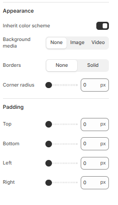
Appearance Settings
- Inherit color scheme
When toggled on, the section adopts the color palette defined by your theme (e.g., background, text, button colors). Turning it off lets you apply custom styling. - Background media
Choose what appears behind the content: - None: No background media.
- Image: Upload or select an image as the background.
- Video: Use a video as the background for dynamic visual impact.
- Borders
Controls whether the section has a visible border: - None: No border.
- Solid: Adds a solid line around the section.
- Corner radius (0 px)
Adjusts how rounded the corners of the section are. - 0 px = sharp corners
- Higher values = more rounded corners
Padding Settings
Controls the internal spacing between the content and the edges of the section:
- Top / Bottom / Left / Right
Each slider sets the padding in pixels for that side. - Increasing the value adds more breathing room between the content and the section’s edge